
I ran across an article recently that explained how pie charts are terrible. Actually ‘explained’ is too soft of a word. These days articles online demand our attention:
“Why Pie Charts Are the Worst Thing Ever and Threaten the Fate of Mankind.”
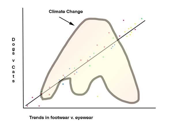
I can’t tell you how many times I’ve come across an infographic like the one above that I could not figure out. Those ones with the straight line and then dots everywhere. Wuh?
I get pie charts. And, as has been well documented here, I like pie. Stay tuned for my crowd-funded project “Save the Pie Chart.”
